“Ask Beau” – “What makes for a good sake label?”
Great question Michael R. from Colorado. First why do you ask? Isn’t a label supposed to act as a calling card for a sake? Pretty simple no? It’s meant to attract your eye and move your wallet. (In theory) Or are you asking why are some sake labels better than others? Well! I am actually in a very good position to comment on this. Why? Well I have watched very carefully as folks have walked around my store for over a decade. I have watched their eyes. I have watched their hands go for bottles. And I have seen what bottles make their way up to the cash register. So I know the proof of what is in the sake pudding! Did that sound right? Proof is in the pudding – get it?
I also happen to be very close friends with a second-generation sake label maker in Niigata Prefecture. His company actually makes sake labels for hundreds of breweries around Japan. (I am also his son’s “White Uncle” here in the Bay Area as he studies at a local university.) So I have very solid opinions as why some sake labels do better than others. I also have first hand knowledge of what goes into the making of a sake label from a brewery’s perspective. Many labels are “expressions” of a brewery or the town where the brewery resides. Many labels are made by local artists, who do the artwork and get paid in sake! There are also many labels that are made by very selective design businesses that do focus group work to see what catches the consumers eye. In a word a label is a brand. Does a brewer always want to have that brand scream off the label? A lot of times no!
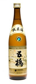
What’s funny is that I have been around so long that I have actually seen breweries rebrand their labels. This is always interesting, because in most cases I am not a fan of the rebranded labels. So what do I like in a label? I like a lot. Sorry that this is a bad answer but it is true. I love the old classic labels like Gokyo Junmai. That label has been around since the 70’s and still looks so solid and cool. It looks like sake. Most of the classic labels don’t have a lot of English or Romanized words on the label and that makes it more mysterious and “foreign,” which I like. Sometimes I like very simple labels with one little tie in character such as a nightingale. Kenbishi from Kobe has a very distinctive and strong label that is actually not what you think it is. The two distinctive characters are one of the most recognized “brands” in sake, but many do not know that one character is a sword tip pointed at you and the other is a shield!
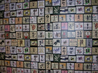
Gosh I could go on and on! I love labels. I collect them. I love the old rice paper labels that are literally slapped on with spit! And I also like the new labels that are affixed with a little glue. I once spent an entire day putting labels on bottles at a brewery in Osaka, so I know the importance and passion that goes into each effort.
The bottom-line is that I like good-looking labels that have a good meaning! I’m all about a story, so if the label helps tell that sake’s story then I like that all the more. I like a blend between classic and modern labels, where there is an old image or character, but there is also Romanized words that helps western people read the name. Many of my friends who own breweries often send me sample labels (Hello Hakkaisan) and ask if “Americans” would like them. Yes, some breweries actually make labels that they think will appeal to Americans. In most cases they are terrible and totally miss the mark! So I will conclude that labels are the eyes to the soul of a brewery and if a label looks crappy then maybe that will be reflected on what’s inside the bottle.